Peter Burman reviews 'The Ins and Outs of PUBLIC LETTERING, Kindersley Inscriptions in the Open'
By Marcus Waithe, Lida Lopes Cardozo Kindersley & Thomas Sherwood, published by Cardozo Kindersley, Cambridge 2020
Why do I think that everyone who cares about the beauty and interest of our villages, towns and cities should read this book? Good lettering matters, first in order to provide clear communication in a public context and secondly because good lettering – in this instance letter-cutting - has the capacity to provide an immediate sense of harmony and well-being across a wide spectrum of contexts ranging from the name of a street to a poignant memorial whether of an individual or a whole community of individuals such as the war memorial on the west wall of the chapel of Trinity College, Cambridge, illustrated on pages 104-105. This memorial was carried out in 1951 by David Kindersley and his assistants, it was cut in situ in Portland stone, and it comprises 4050 letters. Literally a ‘master piece’, but then the same could be said of many of the examples given in this masterly little book.
Who was David Kindersley, left, who died in 1995? He was a prodigiously gifted sculptor and letter-cutter, apprenticed to Eric Gill in 1934, setting up on his own after two years. Following the second World War he established a new Workshop in 1946, in Barton, Cambridgeshire, later re-establishing the present Workshop in a former infants’ school on the edge of Cambridge. His widow, Lida Lopes Cardozo Kindersley, now the consummate master cutter, continues to run that Workshop, and to train apprentices, aiming always for the highest standards in design and execution. Supporting her role is her husband Graham Beck, who has run the administrative side of the Workshop for a good while, and is a Companion of the Guild of St George.
I had the great joy of visiting them in the mid-1970s during the twenty-two years I worked for the Council for the Care of Churches and the Cathedrals Fabric Commission for England. During the whole of that time, I nurtured our Register of Artists of Craftsmen and organised an annual conference which we called The Creative Artist and the Church. David, then, and Lida, now, continue to inspire me to grasp whatever opportunities come our way to encourage the survival, revival and active flowering of craftsmanship today.
The ‘Ins and Outs …’ of the title refer to entrances and departures, and ‘Out’ perhaps also refers to the fact that the examples are mostly but not entirely in outdoor public places. The most public of all lies in the names of the streets of Cambridge. One morning in 1947 David Kindersley ‘woke to find the unique and characterful cast-iron street names being replaced by a particularly bad sample of Ministry of Transport lettering – equally badly spaced.’ David Kindersley, with his sharp ‘seeing eye’, surely influenced by John Ruskin, had the insight to realise that it was not only the letters but the spaces between them that were important. The whole story is told in another Cardozo Kindersley publication, Optical letter spacing, 2001, but suffice it to say here that because of David Kindersley’s insight and passion for lettering the city of Cambridge has what is most likely the clearest and most satisfying street signs in the world, though undoubtedly it has had a widespread influence elsewhere. Mercifully also, and thanks to David’s advocacy, many of the distinguished cast-iron street signs survived. Birmingham also has very fine and distinctive cast-iron street signs and they are always at risk of being replaced by inferior ones.
David’s influence on lettering has been profound, not only through what has come through the Workshop but also because of the apprentices who have learned their skills from him and then Lida. One of David’s apprentices was his son Richard Kindersley, who set up his own workshop in London, and whose work may be seen in and around St Paul’s Cathedral and many other sites. Richard has also run, year after year, a summer school in stone carving at Cromarty on the Black Isle where is one of his finest works, the Emigrants’ Stone.
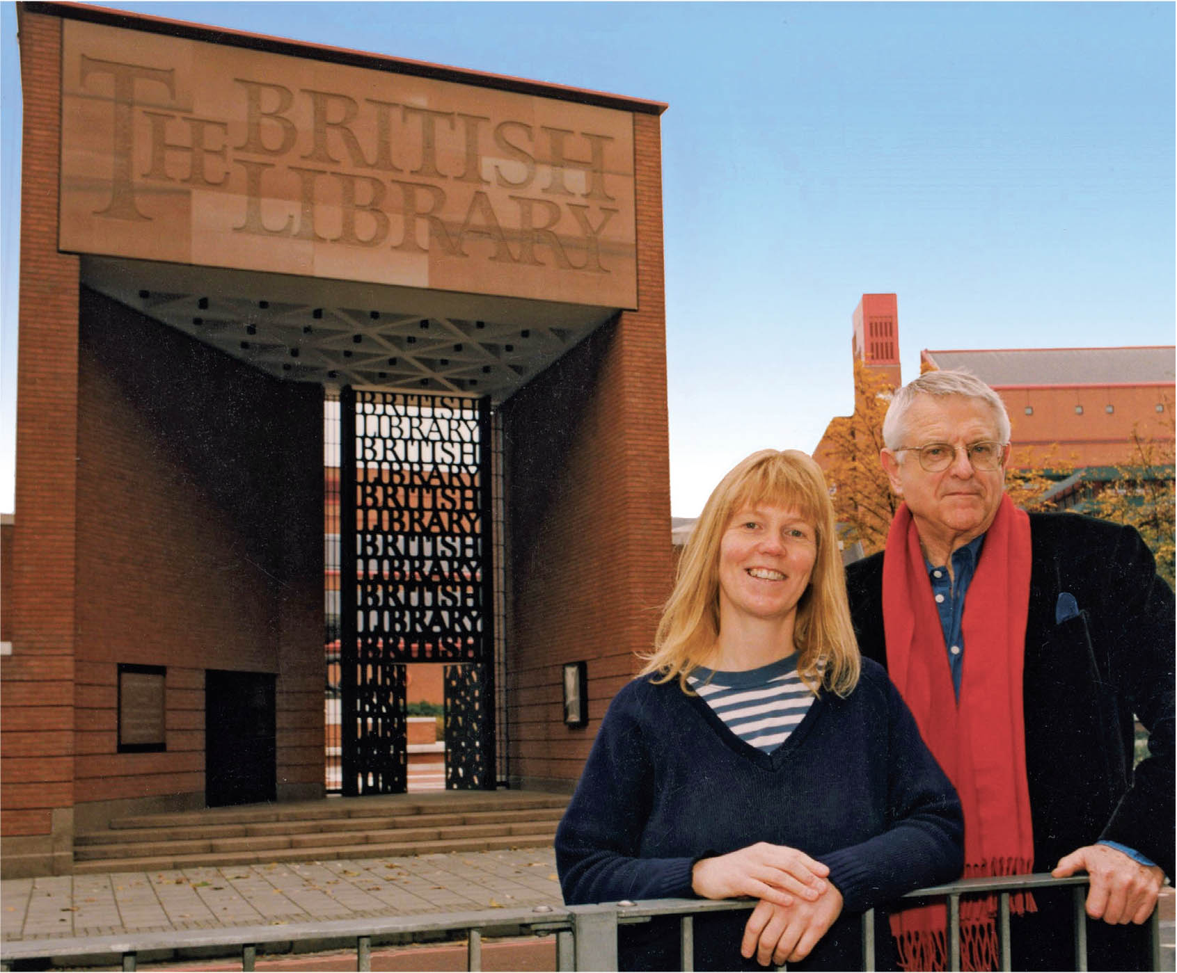
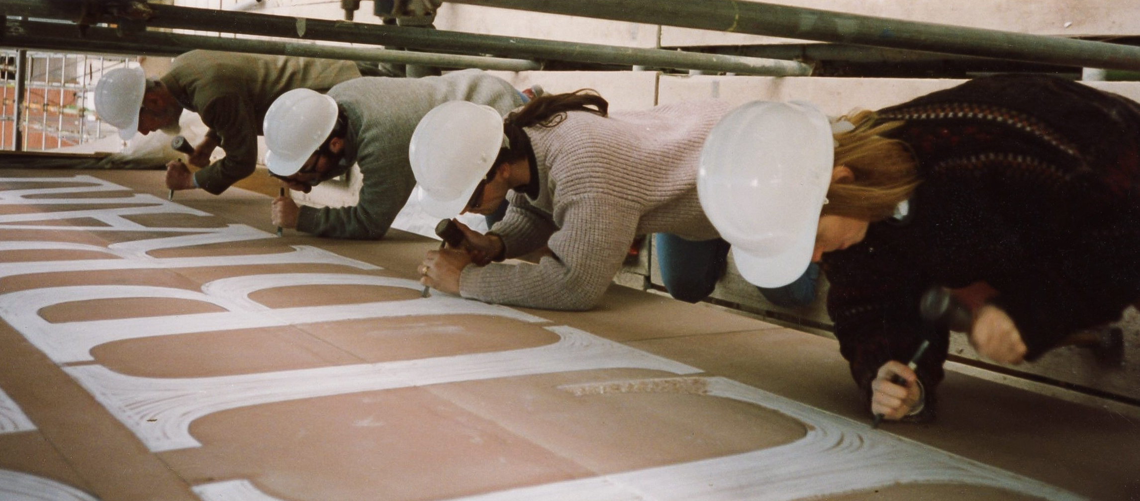
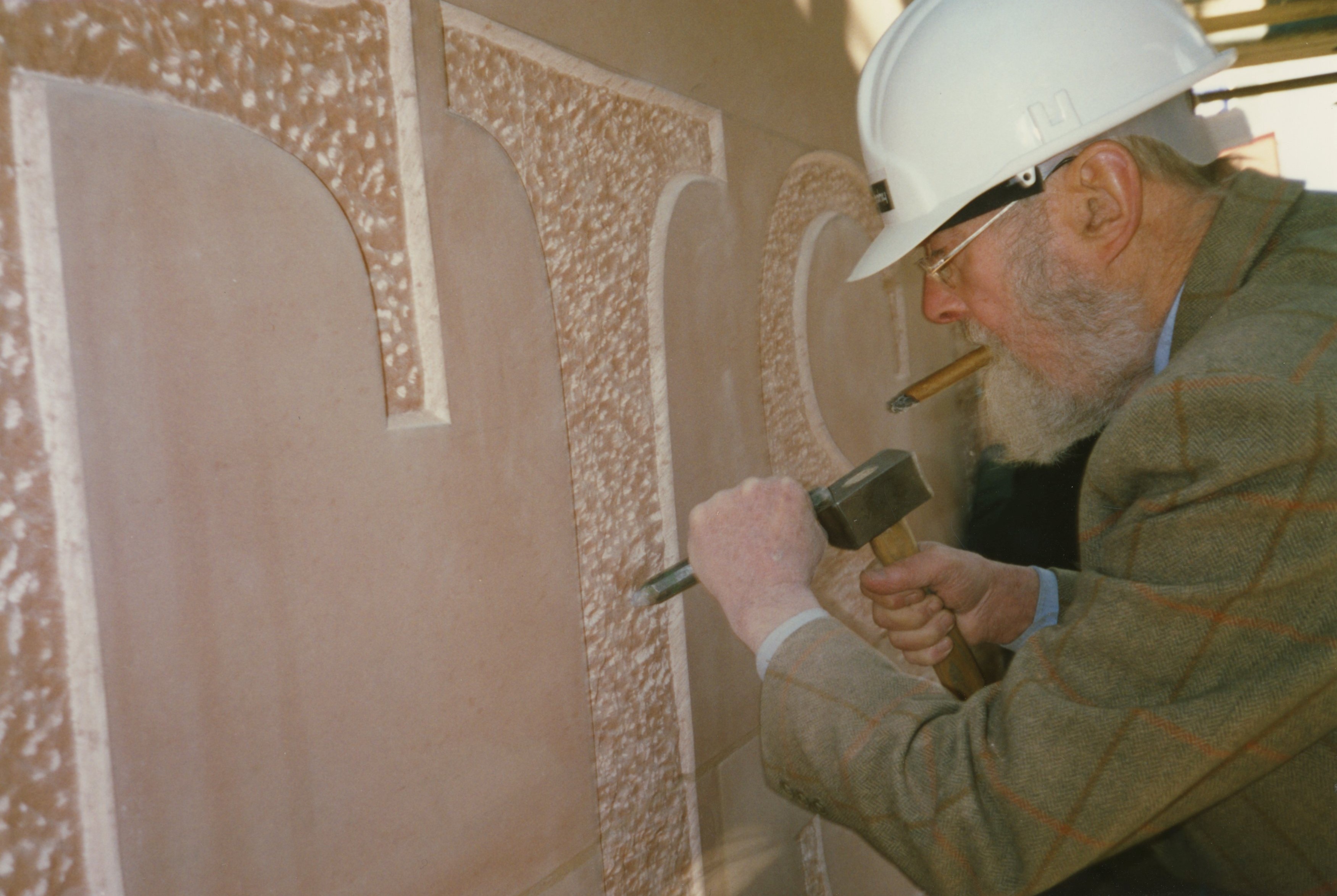
At this point I would like to pay tribute to the design of the book which makes it very easy and pleasant to follow the points which Marcus Waithe, a Companion of the Guild of St George, is making in his text. Pages 17 and 18 are a good example of that. The text is explaining how many and how varied are the notable institutions for which Cardozo Kindersley have provided the lettering. On the opposite side there is a fine image (see left) of Lida with the architect Sir Colin St John Wilson, designer of The British Library (close to St Pancras Railway Station), with the gateway to the Library behind them: on the sandstone arch the first letter ‘T’ is two metres high. Within the sandstone archway the metal gate has ‘British Library’ in letters which have wide spaces between them at the top and then become progressively narrower as they descend, tier by tier, with the words ‘British’ and ‘Library’ alternating. Looking back to the text page there are two tiny precious archive images of the letter-cutting in progress, (see left) on scaffolding high up on the structure.
There is great emphasis on the Workshop’s practice in cutting letters in situ. This must entail an element of risk, not least from the British weather, but must also promote a deep engagement with the project on the part of every member of the Workshop team. On p.47 Marcus Waithe memorably refers to ‘the kinds of exposure – including the bracing effects of wind on a chisel grip – to which public letters and letterers are subject.’
To give the flavour of Marcus Waithe’s insightful and harmonious style of writing it is essential to provide an example and since I want to promote the use of fine lettering in public places, I have chosen the following observation inspired by the frieze of a handsome Memorial Hall in Pickering, Yorkshire: ‘Inscriptions that fulfil public functions need to be concise, direct, legible, and in several ways incisive. But letters in the open do more than convey information; or, at least, they communicate across a broader spectrum than the literal meaning of a text. This comes down to an expanded idea of what reading actually is. The best inscriptions give us permission to slow down. Our eyes are detained by qualities of material, by the varied depth of cut, by a sense of delight or surprise in the setting. They resist the usual informational tug propelling us toward the end of a sentence. Reading in the open becomes, in this way, an act of contemplation. The same applies at the level of the making, so that cutting letters in stone becomes a kind of meditative practice …’ (pp.25-29).
A work well known to me is the circular commemorative stone (actually a sea-green slate from Kirkstone) towards the west end of Orford church where Benjamin Britten’s Noyes Fludde and four ‘church operas’ were first performed. It was cut by David and Lida in 1982 and is a great masterpiece in its own right, though easily susceptible to damage. David used to say that ‘the floor is a great unexplored area’. Therefore, in villagescapes and townscapes, it represents something of an opportunity whereas in churches and cathedrals we are already used to seeing ledger-stones set in the floor, often with superb lettering and carved heraldry. My all-time favourite from the Workshop is the immense ledger-stone (see below) commemorating the medieval abbots of St Albans Abbey in the Choir of what is now the Cathedral & Abbey Church of St Alban.
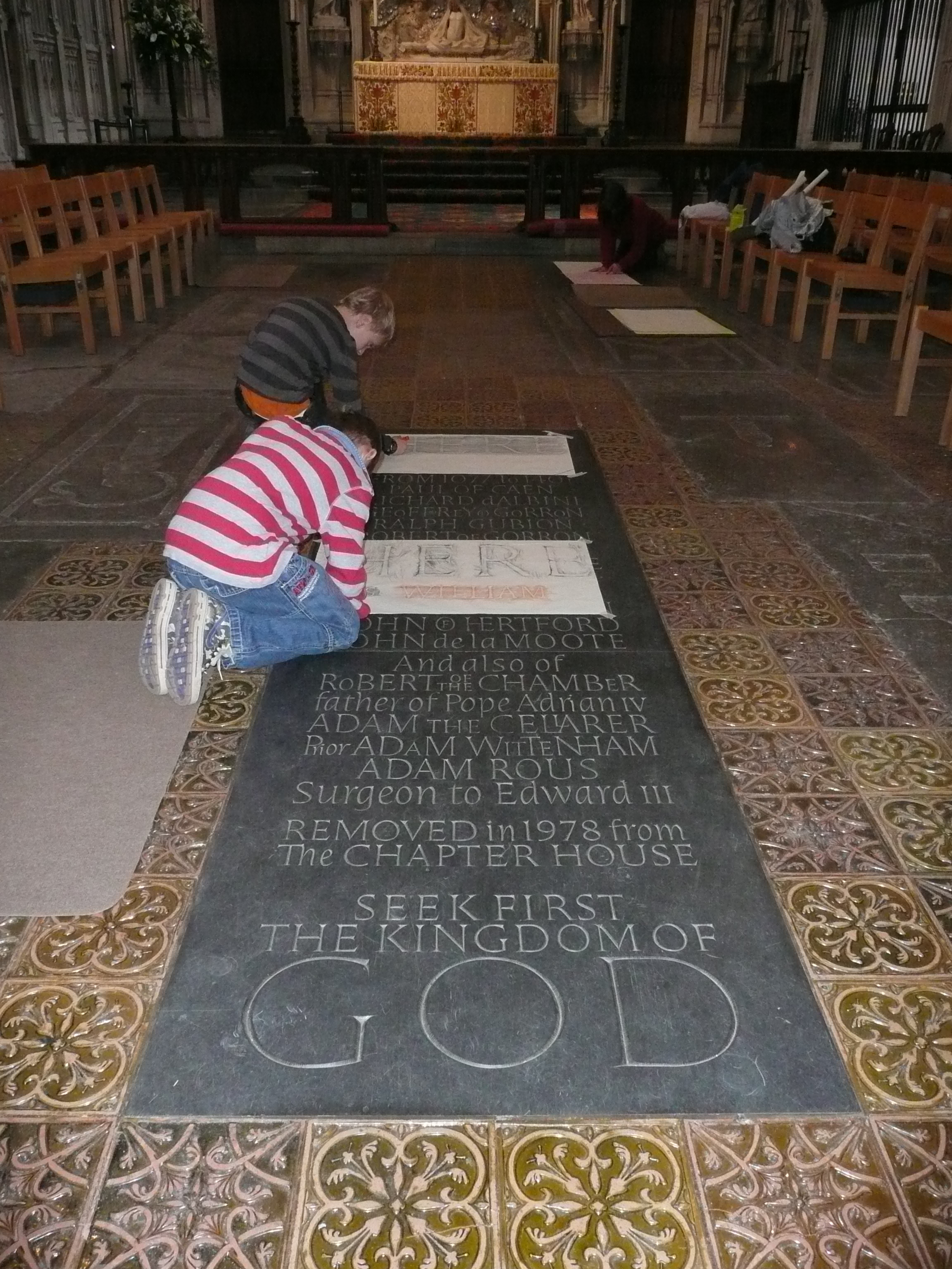
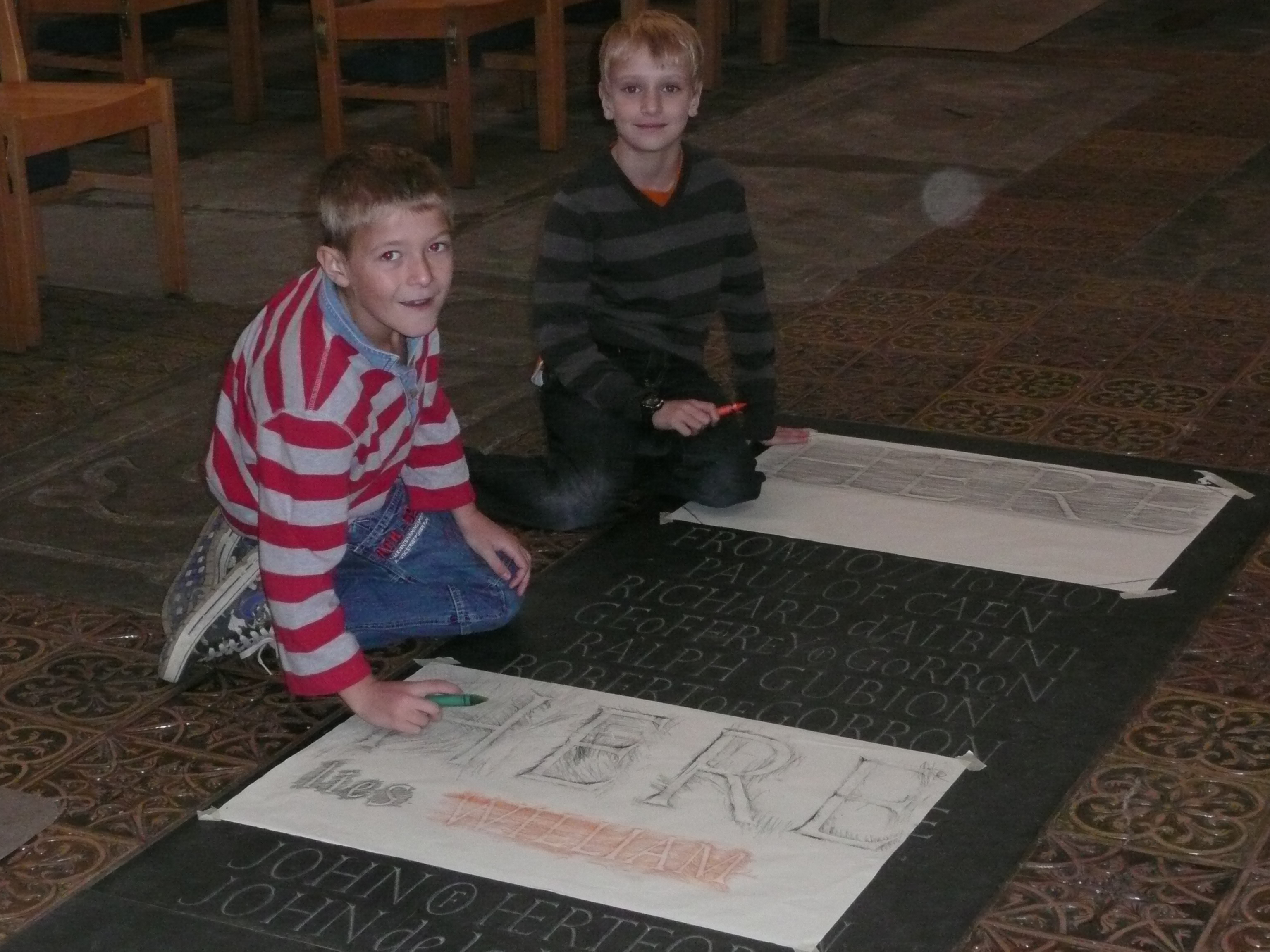
Two boys recording letters on the Abbots' Stone. Photographs by Peter Burman.
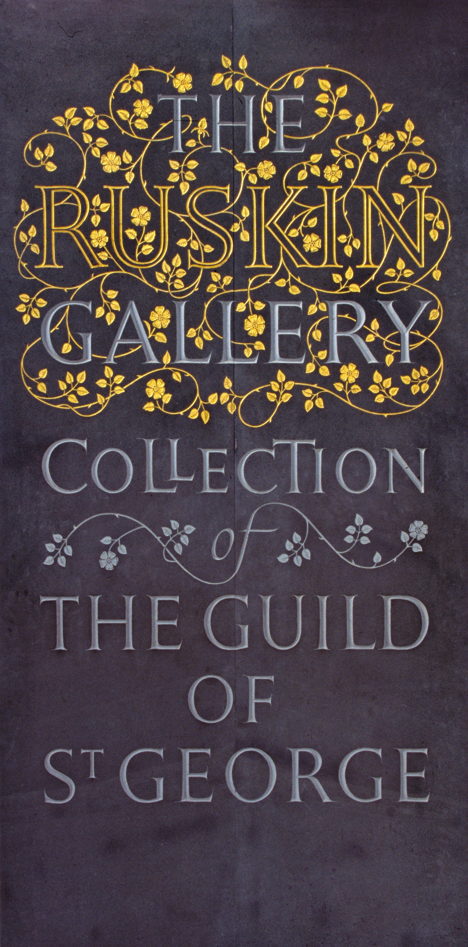
There are references to John Ruskin here and there, as one might expect from a Companion. The Workshop furnished the external inscription on the former Ruskin Gallery, Norfolk Street, Sheffield, with letters of marine plywood stating ‘Founded 1875 The Ruskin Gallery Reopened 1985’. Inside, now in the Millennium Gallery, in Sheffield, was an inscription on green slate of stupendous magnificence (see left) with the words ‘The Ruskin Gallery’ interwoven with a floriated pattern worthy of a medieval manuscript, which was one of Ruskin’s great interests as a collector, and from which he considered – rightly – that we could still draw rich inspiration.
Colour and gilding are conspicuous in the work of the Cardozo Kindersley Workshop, as they have been since Greek and Roman antiquity. The Ruskin Gallery stone just mentioned is an example of the lavish use of gilding which prompts Marcus Waithe to observe that it hints ‘at an overbrimming joy in learning. Entering in this way becomes a mode of re-thinking, redolent of the Delphic admonition.’
Examples are also chosen to show how letter-cutting can transform the humblest of buildings such as the long lintel stone over the doors of a barn on the Isle of Colonsay, Argyll, and a relief carving for Aldrich’s Brush Factory, in Diss, Norfolk. I constantly observe how an inscription can tell us in a few words the historical significance of a place; and we are given the example of the enclosing wall of the Memorial Court of Clare College, Cambridge, below, which tells (what had been almost entirely forgotten) that ‘Here in the first Eastern General Hospital 70,000 casualties were treated between 1914 & 1919.’ An element of beauty, interest and significance has been added in 2016 in a way that relates to the centenary years around 1916. The letters were cut into the existing wall – which should often be possible – and painted dark red, with gilded marks between each word.

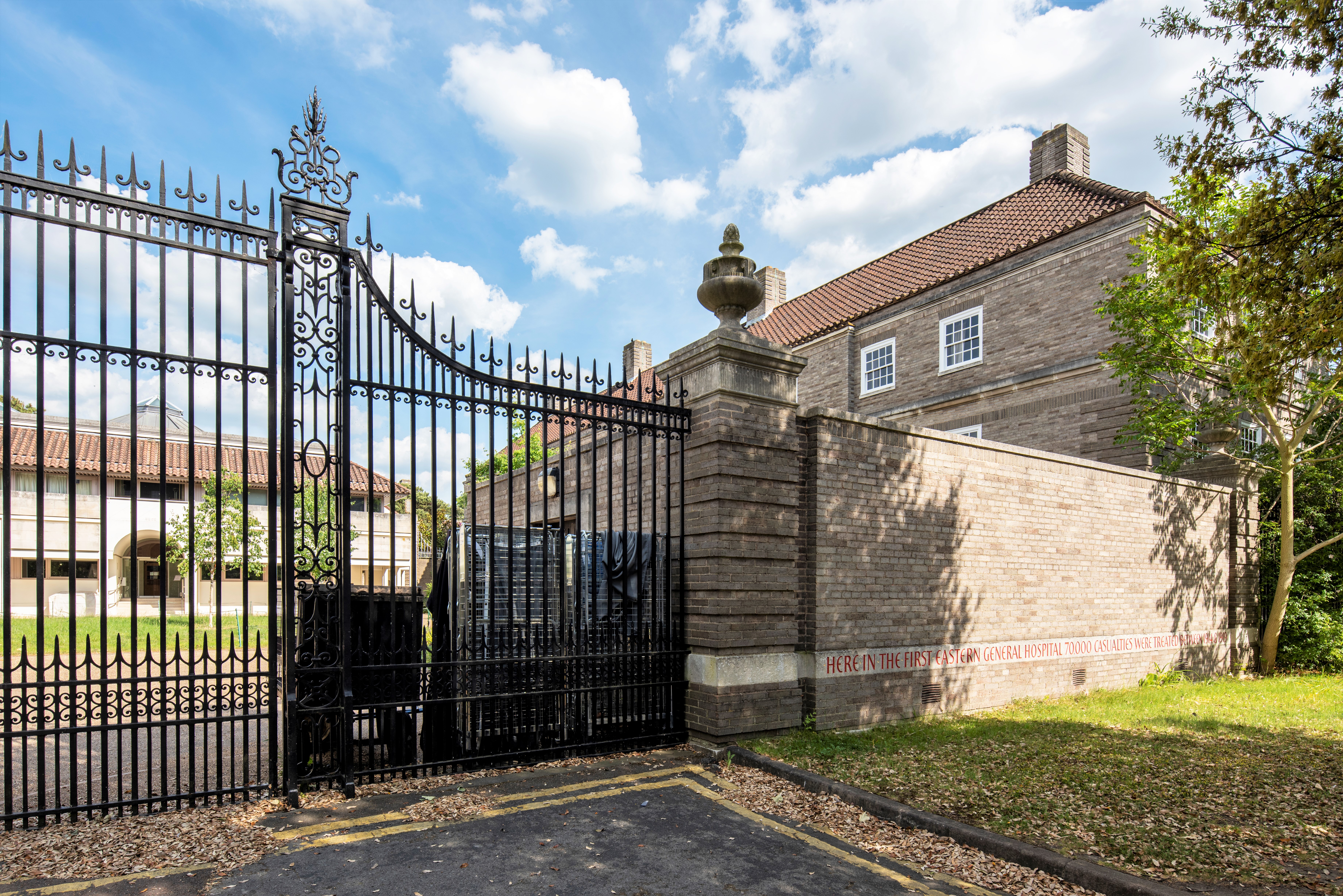
Photograph c George Smith.
The last major topic raised is that of the Workshop’s memorial work. I have long been a patron of an organisation originally called Memorials by Artists and one of the inspiring ideas behind it is the dialogue between the bereaved and the artist, sculptor or letter-cutter, so that what is executed is a grave marker which is individual to that person commemorated, of a material appropriate to that location, and as Marcus Waithe puts it ‘letters that respect valuable materials by harnessing the qualities of stone to the full. Whether exuberant or restrained, a unifying feature is the complete absence of morbidity. Good design is essential, but so too is a willingness to gesture towards character, to register what the deceased cared about.’ A wonderful example is the ledger over the recently established burial place of the poet William Blake in Bunhill Fields, executed in 2018 in Portland stone, a stone much used in the City of London.
Marcus Waithe concludes his essay by saying that ‘when the contract between patron and maker exceeds its usual bounds’ it produces ‘a kind of radiant wealth’, clearly a conscious echo of Ruskin’s ‘No wealth but life’.
I can only urge anyone who reads these words to buy this book, to give it as a present, and to mention it with affection and enthusiasm wherever you go. Others in the series published by Cardozo Kindersley, focusing on carving and especially letter-cutting, have also given me immense pleasure over the years. Favourites of mine include Sundials – Cutting Time (the art and science of 27 Kindersley dials), Cutting Through Nature and, of extraordinary resonance and relevance at the present time, Remembered Lives.
But this soaring marriage of words and images in Public Lettering makes it one of the very best.
PETER BURMAN, 31 January 2021